Blog

Knightfall

Finally!

We, at Outlines, have been waiting for over a year to showcase this work. I am referring to the numerous visual concepts and shooting boards we produced for the History Channel's epic new series, Knightfall.

Outlines was awarded the work so early in the process, that there was no production still photography or film footage shot yet. Many of the first visuals we created were derived from Googling cast member likenesses, visual information on the Templar Knights, and time period. You would think the job would get easier once we got actual reference shots from the show.

Uhhhh... no.

The concepts got harder. The creatives at A&E networks are consummate professionals, dedicated to raising the bar. Here's a taste of one of our creative pow-wows:

Art Director: "We need to see an idea for a shooting board."

Chris at Outlines: "Ok, what do you have in mind?"

AD: "In one continuous motion, the camera will open on a lead character in one setting... push through a portal... into another setting... to reveal other characters in a pivotal scene from the storyline."

Chris: "Ok, no problem. How many frames?"

AD: "One."

You can't make this stuff up!

I now present the one frame wonder! 

pope_color.jpg

Here is more of the work that Outlines created for Knightfall:
isabelle_color.jpg
king_color.jpg

Sometimes... It's More Than Just A Job

Chris and the Outlines Crew recently had the pleasure of completing a very unique job.

A proactive entrepreneur was looking for an illustrator to adapt his original character and storyline into a comic book format. The mission was to create a fun and entertaining way to inform the preschool to second grade target market about social awareness and climate change. After all... the children are our future. Outlines Inc. has been given permission to showcase the art we produced by the author of this groundbreaking comic book. 

p0.jpg
p1.jpg
p2.jpg
p3.jpg
p4.jpg
p5.jpg
p6.jpg
p7.jpg
p8.jpg
 

Amazon's "The Tick"

And the fierce battle cry rings out over the sleeping city... SPOON! 

Yes! He is the Tick! And he's being rebooted in a new Amazon Original Series. Outlines Inc. could not have been happier to answer the call to duty and work up some promotional visuals for the show. 

The Comps That Did (And Didn't!) Make It

Sometimes you work on a project and it all clicks... the concept is on target, the visuals work, and wham! you've hit a home run. You've helped create an iconic image that will represent a particular film or television series for eternity (or for whatever passes for eternity in this "flavor of the minute" industry).

Then again, some comps are just passing thoughts. However, that doesn't mean the work is not noteworthy!


HBO's "Divorce"

HBO's "Divorce"

A&E's "Bate's Motel"

A&E's "Bate's Motel"

HBO's "Ballers"

HBO's "Ballers"

Warner Bros'. "The House"

Warner Bros'. "The House"

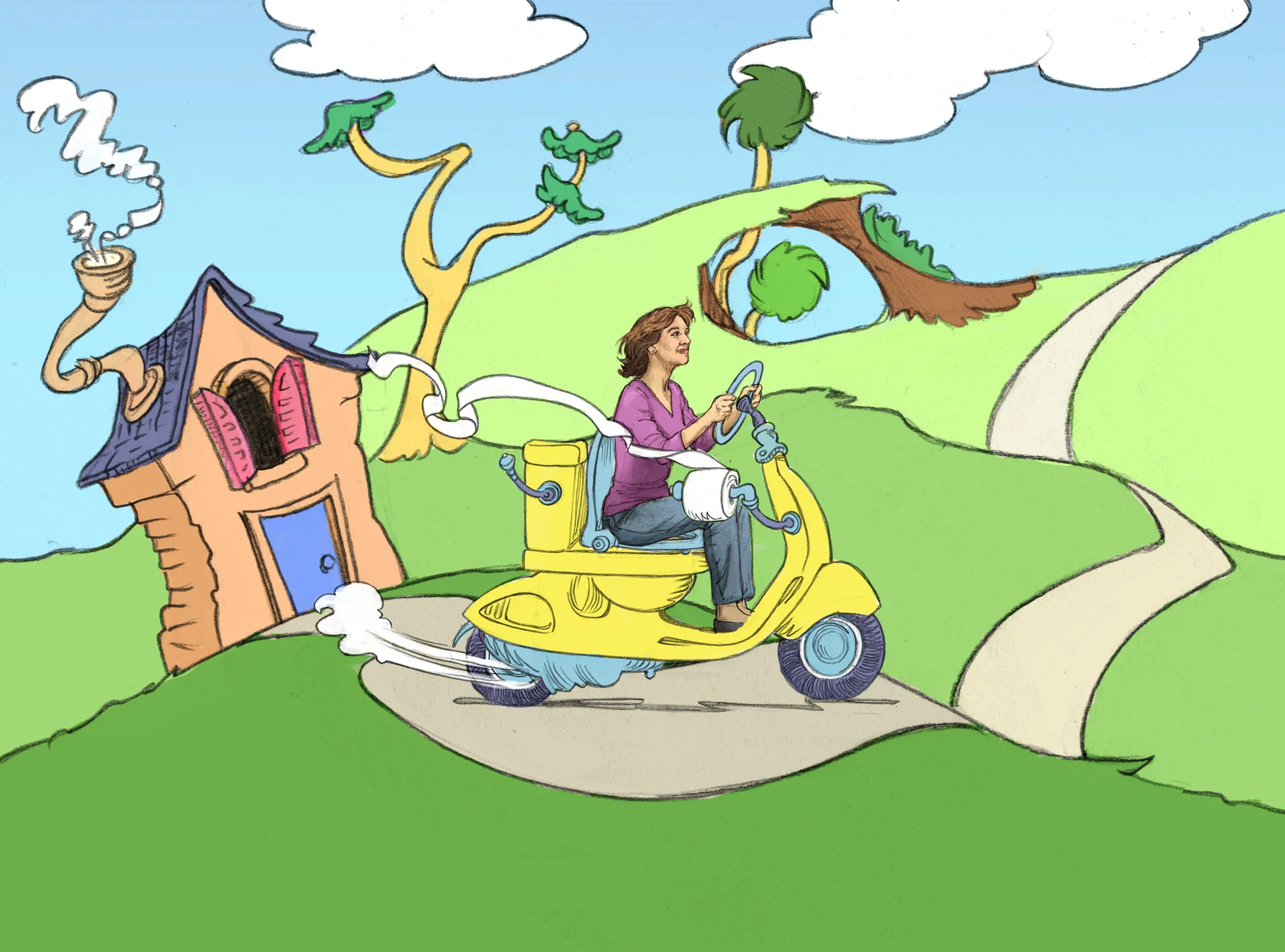
Dr. Seuss Potty-Scooter

Refining the concept is all about nailing the subtleties of visual storytelling to send the right message to your target market. 

These Dr. Seuss-esque illustrations are a prime example of the impact a visual makes on the message. The creative’s concept was a fun, lighthearted approach to the more serious problem of incontinence and it’s limiting effects on people’s mobility. 

I had so much fun designing a Dr. Seuss inspired “potty-scooter” and matching environment, but it wasn’t until I sat the realistically drawn woman on the scooter that I realized the first illustration sent the wrong message. 

Rather than a sense of freedom from her affliction, she looked more inhibited by it, as if she was literally “on the go” at all times and could not be parted from her toilet - not good!

After a rehash of the visual concept, the creative and I arrived at the second illustration. Thus, the old lady that lived in the toilet was free to live her life unfettered by her incontinence - the right message!

And we all lived happily ever after.